On October 12, 2012 N wrote:
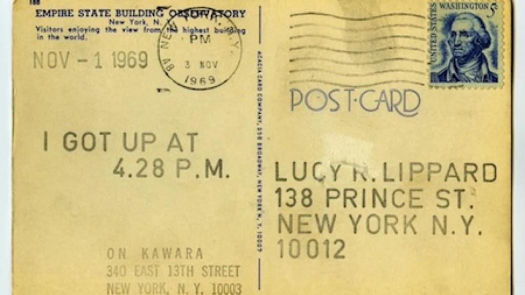
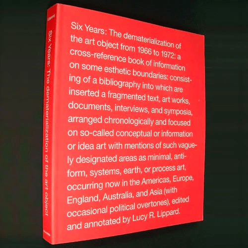
When I was at school there was a curious book by Lucy Lippard called ‘Six Years: The dematerialisation of the art object ‘ – which was a survey of what was emerging as conceptual or informational or idea art in the period 1966 to 72.
In my simple-minded way I think of dematerialisation as one of many responses to a generalised crisis of image making for the game of fine art. As I remember, it appealed to me because it was arrogantly playful and the art it discussed demanded nothing in the way of skill or craftsmanship. Art had no necessary shape or form, it could be intangible, conceptual. It sprang out of the line of Readymades,

but no longer required even anointing something, it could just be spoken about, temporary – its momentary performance being all there ever was (like a stream of piss.) It might seem like a long (and protective) distance between that and what faces designers now, but I think there are some similarities – not least in the way design for modern technological devices approaches a momentary performance – all the old certainties of design are ‘dematerialised’ – they don’t have any necessary form. Our designs are flicked at for a moment on almost unknown devices in almost unknown contexts.
I get the feeling that the retreat to letterpress or just poster-making in design courses is a way to put control back into design. The grid came to dominate design and new digital machines leave no trace of human hand so the only route back in the face of complete mechanisation is to retreat to older processes that show human touch. It is a simple opposition of craftsmanship vs technology which is a very dull response to technology.
It’s weird longing for a time before the Fall – before the separation that language and technology brought with it. It’s an entirely crazy longing because there is no time before. It’s a hippy lust-filled dream for a world where mark-making was transcendent and brought together some sort of mystical commune without separation. Our culture is technological – the very act of speaking – naming and numbering things is technological and analytical – we have no way of thinking outside our technologies.

We are always already digital there’s no technological overlay – technology is primary – we count, we name, we write, we interrupt and analyse. We atomise everything and then order it in grids if we are designers.
The kind of design we do is digital design, like any normal well-adjusted English pragmatists it has elements of craft and elements of modernism, but its new distinguishing characteristic is that it doesn’t know its context. We can’t be even roughly sure of the screen. (We can do things to try to hunt down through lightning fast detective work what the technical specification of the screen and the software it’s running might be but it’s never enough.) For instance iPhones (or at least some iPhones) have a resolution of 1136 x 640 – more than many laptops and some desktops. It’s hard to know what the screen size is, what the pixel density is. It’s hard to know how you can interact with the device. Does it use a numeric keyboard to input alpha information? Does it have touch? Multi-touch? Can you yell at it? Does it have a mouse? A trackpad? A nipple? Can you wander around in front of it like a Kinect?
Not only do we not know what device anyone might use, we know very little of their context. We don’t know if a user is sitting, if they are sitting we don’t know whether they are travelling at 300kph or dozily half-watching Soccer Saturday.

We call upon anthropology to help us understand. We make models of possible types – personas with little back stories so flimsy they would make Barbara Cartland blush in her grave. We look for other sociological and ethnological props, but basically we are sort of adrift – this drift is one reason why the single-minded genius approach has such traction – “I design for myself right or wrong.” Design has divided up into two camps:
- Design based on user research: how they behave, which features they want, what they do – Google is pre-eminent in this – their search engine is the world’s biggest listening device for understand what people want.
- Vision Designer: Designer who has a vision of what they want to make. They are designing for the user they imagine. Apple is a perfect example of this – it’s a team of designers working in secret, not interacting with users, focusing on core principles.
Both camps are faced with the same uncertainty at the heart of modern design. The digital canvas has no edge – it is boundary-less – all we do is fight rear-guard actions to try to contain the design but it fails – (we have the will to fail) Now there’s a problem for design – a problem of grids: without a fixed size there’s no fixed grid, no necessary relationships. It’s unnerving. It doesn’t help those with OCD who want everything to line up. Fixed grids – whose time came with mass manufacture – may now be over with radical uncertainty of digital design. Golden section, Fibonacci series, etc – all mean much less when size shape and aspect ratio are all mutable.
The certainty of fixed grids that excite passages about harmony and beautiful is either over or under threat.

Design now is afflicted by thousands of unknowns or partially knowns. Designers aim at a transcendent device independence, but end-up doing the grubby high technical detective work trying to figure out what should be displayed where to whom. The re-emergence of the poster as the dominant form for design courses is a safe, dull hiding from complexity, hiding from the real contemporary context of design.
This uncertainty has been around since the get go – the original Mac had a 9 inch 1 bit black and white (actually black and very light blue although not as blue as this photo) screen for chrissake –

It was only when we entered the golden age of PCs that many designers decided to ignore the problems of screen diversity – or chose to limit fluidity for rational reasons to do with line length. Graphic design suffers in the context of uncertainty. What can old relationships of harmony mean when you have no fine control over representation? Many designers have chosen to ignore it – either by refusing to participate in what they see as a poor and attenuated medium or by pretending that there is surety – la la la la I can’t see you. The advent of new and different types of astonishing devices, lusted over by designers, with screens of such finesse they sort of rival the resolution of paper has made the problem of uncertainty more real and more pressing. It’s a test of mettle.
In some ways the problem is reflected or articulated by the tactical opposition of apps and websites. Apps in the Apple ecosystem at least give some sort of surety – but even that has now become thoroughly eroded – firstly by the change in screen resolution and now by the change in aspect ratio – nevertheless there is some residual certainty which elegant apps like Flipboard exploit.

Devices are not only getting smaller they’re getting bigger, they can have more than one screen, they can be sort of 3D. We can’t determine the physical context, there isn’t one common input method. The device is the canvas, but the canvas isn’t fixed. There are only coping strategies. What you see is not what you get – it renders differently on different devices. There is no “Preview” button that can show what a site will consistently look like.
When perfect control is impossible we need to find a new way of describing designs. We have to embrace the Pandemonium: know the capabilities and limitations of each devices. How do you do that? Through detective work.
In fact detective work is a pretty serviceable metaphor for the design process in general – you start with some general ideas, hunches and intuitions and you work through a process of reasoning to some sort of conclusion. Much of this work is invisible to designers with narrow focus – there’s a whole bunch of things done that seem ineffably virtualised such as server-side device detective work. Even those who know of server side detection deride and fear it for unreliability. Device detection is difficult. However, the complexity is equal to the complexity of media queries in responsive design solutions. The perception of device detection being a hobbled mess probably stems from working around browser flaws in the early days of the Web. Server-side detection gives you control of what you send to each device. This gives you a huge expressive range: change input interfaces, loading time, rendering time, CPU overhead, battery drain, etc. which is cool if you take design seriously, but there’re a lot of things feature detection can’t tell you: hardware, device type, does it have a camera, etc. Designers seeking control can also take a grip on site architecture to provide different views of single URL or produce different sites or sub-domains for each experience; and more. But the picture is always muddied. Some user settings can’t be known in advance on the server (cookie, orientation, iPhone versions, etc.).
We live in a world of dependencies: OSes, libraries, breakpoints, which means we need to keep all our dependencies updated. External dependencies are subject to the same entropy you are, they eventually fail. Making sensible defaults will provide graceful degradation when faced with unknown devices. Digital design is still just an inbetweener – it’s wrong, it’s stupid, it’s fucked up and it doesn’t know what it’s doing. It doesn’t mean grids are disappearing or failing, they just aren’t fixed. A grid might be 960px wide, and at some other point 360px. Each column could be almost anything. It’s one of the great challenges for designers now.
There’s still considerable refusal to recognise the challenge. Not so long ago the agency of record for one of our clients American Express was enforcing a letterbox of fixed dimensions for all the most frequented/most important pages/sections/parts of AmericanExpress.com. Leaving aside the mad insistence on Flash – itself a way of clinging on to brittle fixity – the designers clearly loved the sense of control the fixed dimension of the letterbox gave them. They made their decision comfortable by claiming that people didn’t scroll. They had a fixed view of design and a fixed view of behaviour (people never scroll) which gave them a way to enforce a grid no matter what the content. They did this in the face of the evidence – people do scroll. The human trough that is the dailymail.com the most popular site outside of a search engine proves as much. Dailymail.com is extremely dangerous – following is the only safe way to consume it.
Designers need to ‘get to grips with’ ‘get in touch with’ and ‘start to handle’ grids in uncertain contexts. They need better tools to do this. Photoshop might not be one of them. In the end (graphic) designers need to think about grid design systems. It’s complex and unsettling. We are currently using Foundation from Zurb and Bootstrap from Twitter. It’s a bargain with the devil – we find ourselves captured by these frameworks – we modify them and that tends to create a bit more mark-up than is strictly necessary which then needs to be trimmed, because we live and die by performance not grids – but thankfully that’s a different post.
 Overwrought